How to choose furniture colour: sample test
How to choose furniture colour when a screen and a bulb alter a decor's shade? Test a sample at home in 9 steps: light, floor, upright and flat. PDF checklist.
Autor: Amussim editorial team
Opublikowano:
Ostatnia aktualizacja:
27 min read
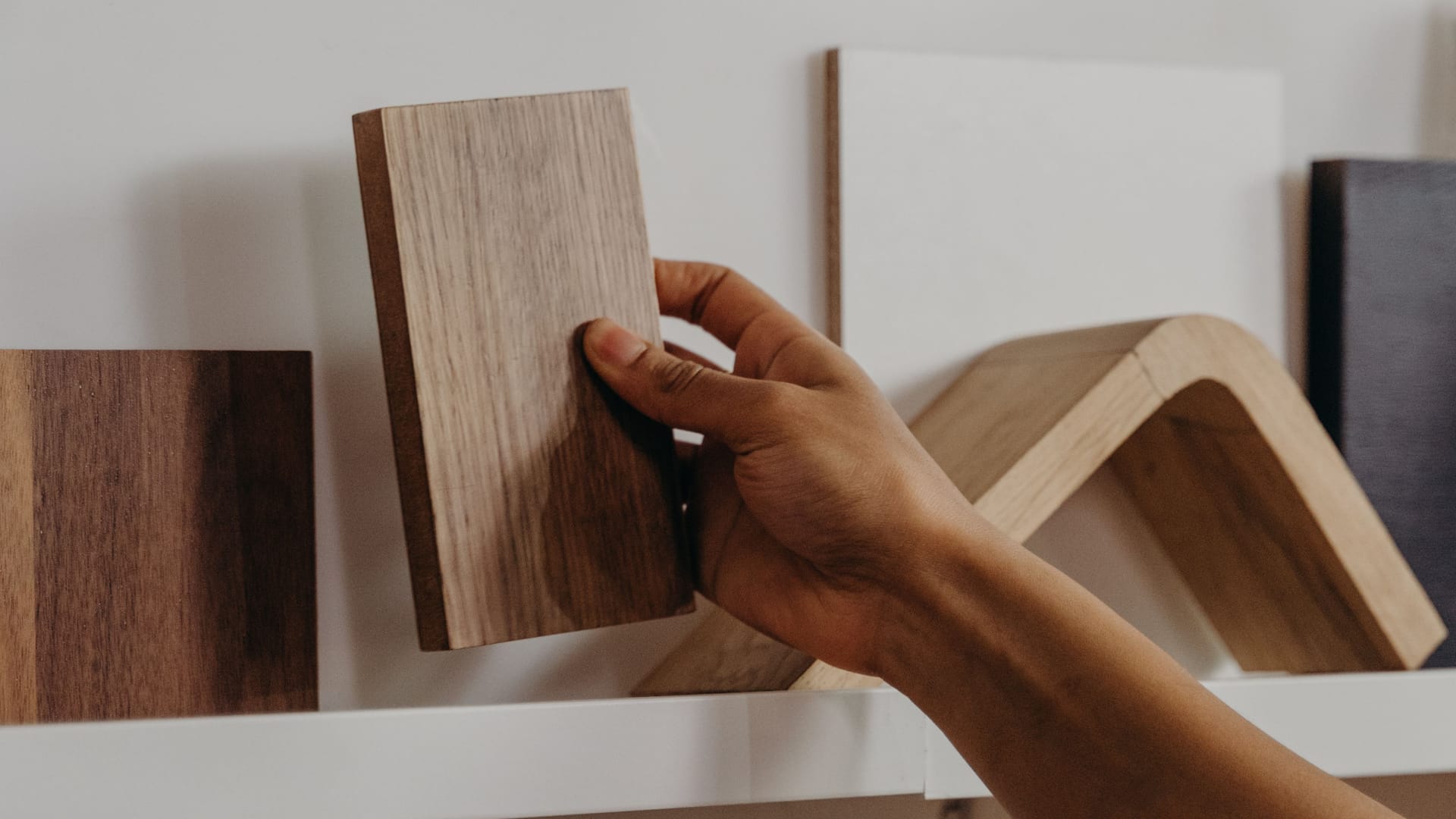
How to choose furniture colour, when a decor picked in the evening on a phone rarely looks the same once the board stands in the room? A screen has its own white point, a bulb has its own colour of light, and the floor reflects light onto the front. Nobody is cheating here. This is simply how colour vision works.
You have a few decors in front of you and worry that the "oak" will turn out too yellow or the "grey" too cold? Here you will see why a photo of a decor differs from the board, how light changes a shade, and how to judge a sample with our 3 × 2 Test. After that come tips for floors, walls and small rooms.
In short. Start with the elements you will not change: the floor, the worktop, the doors and the windowsill. Check their undertone, warm or cool. Choose a decor that is tone on tone, meaning the same undertone, or clearly lighter or darker. Finally, judge a physical sample in your own light, morning and evening, not a picture on a screen. Our 3 × 2 Test: you look at each sample at 3 times of day in 2 positions, as a front and as a worktop. For each observation you give 0 to 2 points, 12 at most. The rules, a worked example and a score sheet are in the section on judging a sample and in the PDF file.
Why does a decor on screen differ from the board?
A photo of a decor is a reproduction, not a sample. The board maker EGGER says so plainly on the page of its virtual design studio: "All decors shown and mentioned by us are reproductions. Colour-matched decors can be chosen only on the basis of an original sample". The rule also applies to the photos and visualisations in our shop.
Before a photo of a board reaches your eye, the colour goes through at least three transformations.
1. The camera sets a white balance. The phone guesses what in the frame is white and shifts all colours so that the white comes out neutral. Oak photographed under a yellow lamp can therefore look cooler in the picture than in real life, and a grey decor in cool light from a window can warm up.
2. The file lands on a screen with its own calibration. Photos online are usually saved in the sRGB colour space. Its specification assumes a white matching the D65 illuminant and a screen brightness of 80 cd/m² in a dimmed environment (W3C, sRGB). A laptop in a sunny room or a phone on a bus rarely works in such conditions, so the same file looks different on them.
3. The system deliberately changes colours. According to Apple Support, True Tone adjusts the colour and brightness of the display to the ambient light. Night Shift moves the screen colours towards the warm end of the spectrum. Other systems have similar night modes. In the evening, with a night mode on, every decor on screen looks warmer than it is.
A screen is useful for narrowing the choice to two or three decors. In the Regał Linea configurator you set a dimension to the centimetre and see the price straight away. Narrow the colour down on screen, and make the final decision after you have seen a physical sample. If you are still choosing which piece to order, first browse made-to-measure furniture.
How light changes furniture colour: 2700 K, 3000 K, 4000 K and daylight
Colour temperature describes the colour of light in kelvins (K): the lower the number, the warmer and more yellow the light. The reference for average midday daylight, the CIE D65 illuminant, is 6500 K, and incandescent light (illuminant A) is 2856 K (X-Rite, Understanding Illuminants).
A decor has no single "true" colour. A board reflects part of the light that falls on it. If the light contains little blue, cool and grey tones lose definition, and yellows and reds get stronger. That is why the same front, by the window in the morning and under a lamp in the evening, is two different colours to the eye.
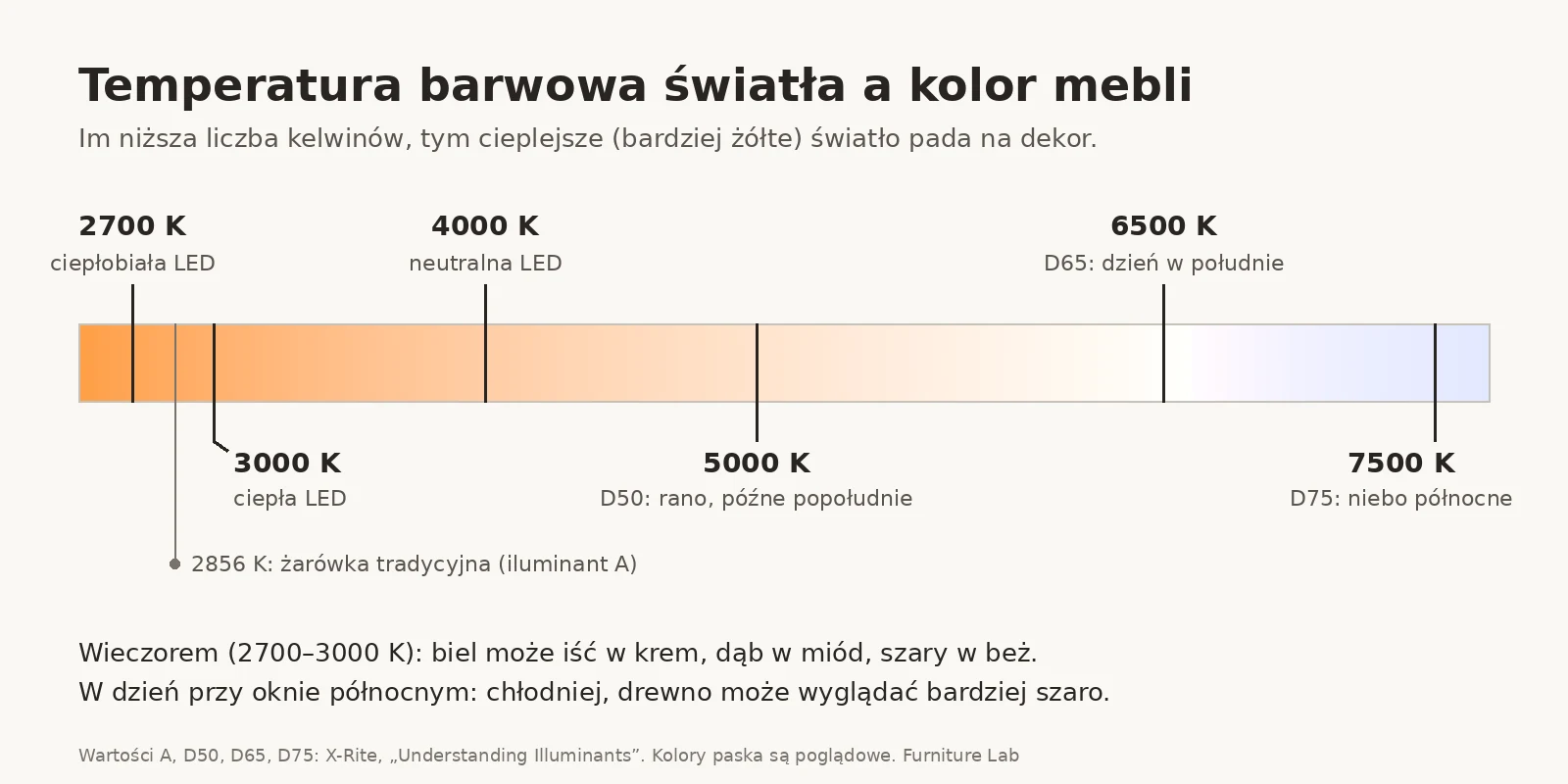
The table compares each light source with midday daylight (D65).
| Light | Colour temperature | How a decor looks compared with daylight | What to check in particular |
|---|---|---|---|
| Warm-white LED bulb | 2700 K | clearly warmer: white moves towards cream, oak turns more honey-coloured, grey comes closer to beige | Biały mat, Szary kaszmir |
| Warm LED | 3000 K | the same direction, a little weaker | wood decors next to the floor |
| Neutral LED | 4000 K | clearly warmer than at noon, but less than at 2700 to 3000 K; compared with those, greys are cooler and wood is less yellow | Beton ciemny, Jesion bielony |
| Midday daylight | approx. 6500 K (D65) | reference point | all decors |
| Light from a north sky | approx. 7500 K (D75) | cooler than at noon, wood may look greyer | rooms with north-facing windows |
The D65, D75 and A values come from the CIE standards described by X-Rite. The third column describes a general tendency that follows from the colour of the light. It is not a measurement of our boards.
On a bulb's packaging, besides kelvins, you will find the colour rendering index CRI (Ra). Since 1 September 2021, light sources placed on the EU market must have a CRI of at least 80, with exceptions including outdoor and industrial lighting (Commission Regulation (EU) 2019/2020). The scale ends at 100. The closer to that value, the more faithfully the lamp renders colours, so to judge a sample choose the lamp with the highest CRI you have at home.
Metamerism: why two browns match by day and not in the evening
Metamerism is a phenomenon in which two colours look matched under one lighting and stop matching when the light changes (Datacolor). It concerns materials that reflect light differently although they look the same under one light. A laminated front, a wooden floor and a lacquered worktop can look like the same shade in a furniture shop, and not in your flat in the evening.
Datacolor also describes geometric metamerism. In this variant two samples look matched from one viewing angle and not from another. According to Datacolor it often occurs with metallic finishes, textured fabrics and directional surfaces, among others. For furniture the conclusion is simple. View the sample, and whatever you compare it with (floor, worktop, wall), at the angle at which you will see them every day.
How to judge a decor sample at home: the 3 × 2 Test step by step
Judge a decor sample where the furniture will stand, in the same position as the front or worktop, at three times of day and next to the floor, the wall and the handles. A single glance by the window at noon is not enough, because in the evening the same room is lit by a lamp of a completely different colour.
- Narrow the choice to 2 or 3 samples. Comparing in pairs is easier than judging eight decors at once.
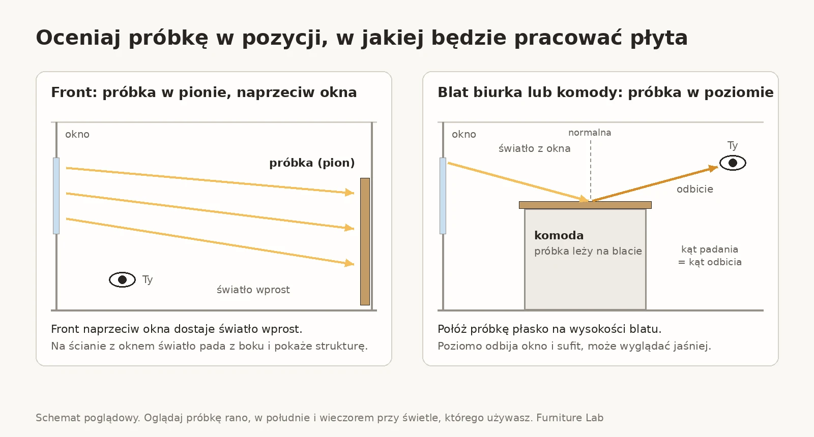
- Put the sample in its final place. Not on the windowsill and not on the kitchen table, but by the wall where the wardrobe or chest of drawers will stand. A front opposite a window gets direct light, and a front on the window wall catches it from the side and shows the structure more strongly.
- Position the sample like a board in the furniture. A front stands upright, so lean the sample against the wall or fix it with masking tape. A desk or chest-of-drawers top lies flat and reflects the ceiling and the window, so it can look lighter than the same board upright.
- Look in the morning, at noon and in the evening. In the evening switch on the light you really use, not only the ceiling lamp, if you normally have a wall light on.
- Put the sample next to its surroundings. Lean it against the floor, hold it against the wall, the worktop, the handles, the curtains and the sofa.
- Look from two distances. Up close you judge structure and matt finish, and from the place where you will most often see the furniture (for example from the sofa or the door) the overall shade.
- Check the surface at an angle. Move your phone torch low over the board. Wood structure casts tiny shadows, and a matt finish scatters glare instead of concentrating it.
- Enter the points on the 3 × 2 Test sheet. For each of the 6 observations write 0, 1 or 2. Take photos only as notes: with night mode off, with a white sheet of paper in the frame and always from the same spot.
- Decide the next day. Compare the totals and check at which time of day the samples lost points.
The 3 × 2 Test: how to score
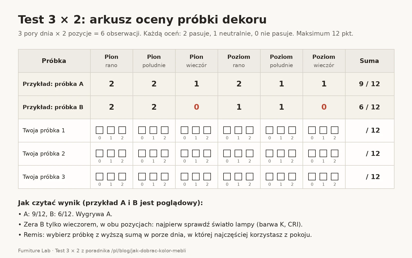
You look at each sample at 3 times of day: in the morning, at noon and in the evening under your own lamp. Each time you place it in 2 positions: upright like a front and flat like a worktop. That gives 6 observations. You rate each from 0 to 2 points: 2 = matches the floor and walls, 1 = neutral, 0 = does not match. The maximum is 12 points.
An illustrative example: sample A gets 2 + 2 + 1 upright and 2 + 1 + 1 flat, 9/12 in total. Sample B gets 2 + 2 + 0 and 1 + 1 + 0, 6/12 in total. A wins. Sample B's zeros appear only in the evening, so check the lamp light first. In a tie, choose the sample with the higher score at the time of day when you use the room most.
How to order decor samples and what to ask
Before you order decor samples, ask the shop a few things. The answers decide whether the sample will show the same as the furniture.
- Is the sample a piece of board or a print? A print on paper will not show structure or matt finish.
- Does it have the same structure and finish as the board for the furniture? The same pattern with a different structure catches light differently.
- What size is it? A larger sample shows the wood pattern better.
- For veneer: does the sample have the same finish? A finish, such as oil, can change the shade of wood, so compare the sample with the same finish as the furniture.
- Is the sample paid, how long does delivery take and does it have to be returned? Plan the test so that you have time to view the sample in the morning and in the evening.
You can ask about samples of our decors through the contact form.
A small sample and a large front
A sample shows colour and structure, but not the rhythm of the pattern over a large surface. Szafa Kolumna (the Kolumna wardrobe) is 240 cm high in its default size. On such a large front, the grain and the repeats of the pattern line up in ways you cannot see on a piece of board. The same applies to a worktop: on the 140 × 70 cm of the Biurko Rama (the Rama desk), the wood pattern will be more visible than on a sample.
If you hesitate between two wood-effect decors, ask for a photo of a whole part or of finished furniture in that decor.
How to choose furniture colour for the floor, walls and room size
Furniture colour can work with the floor in two ways: tone on tone or by contrast. Tone on tone works when the wood of the furniture and the floor has the same undertone, warm or cool. Contrast works when the difference in lightness is clear, for example a light front on a dark floor.
An undertone is easy to check. Lay a white sheet of paper on the floor, put the sample beside it and look at all three at once. Warm shades lean towards yellow, orange or red. Cool ones go towards grey, green or blue. If the floor and the sample "pull" in opposite directions and have similar lightness, the combination can look accidental.
The hardest case is "almost the same oak": wood of similar lightness to the floor but with a different undertone. Such a pairing can look like an accident rather than a deliberate choice. Then choose a decor in the same undertone (tone on tone), clearly lighter or darker than the floor, or a plain-colour decor.
What colour of furniture for a light floor?
A light floor suits a light contrast or wood in the same undertone. From our decors, start the test with Biały mat (matt white) and Jesion bielony (bleached ash). With a light oak of a warm undertone, add Dąb Halifax naturalny (natural Halifax oak) or Dąb olejowany (oiled oak). Avoid wood of similar lightness to the floor but with a different undertone.
What furniture for a dark floor?
With a dark floor the simplest option is a light contrast: Biały mat, Szary kaszmir (cashmere grey) or Jesion bielony. Dark furniture on a dark floor can also work if both woods have the same undertone. In that case take Orzech Lincoln (Lincoln walnut) or Orzech amerykański (American walnut) for the test and view them in the evening.
What colour of furniture for a grey floor?
With a grey floor you have two directions: monochrome (white, grey, concrete) or warm wood as a contrast. For monochrome, test Biały mat, Szary kaszmir and Beton ciemny (dark concrete). As a warm accent, try Dąb Halifax naturalny or the Dąb olejowany veneer.
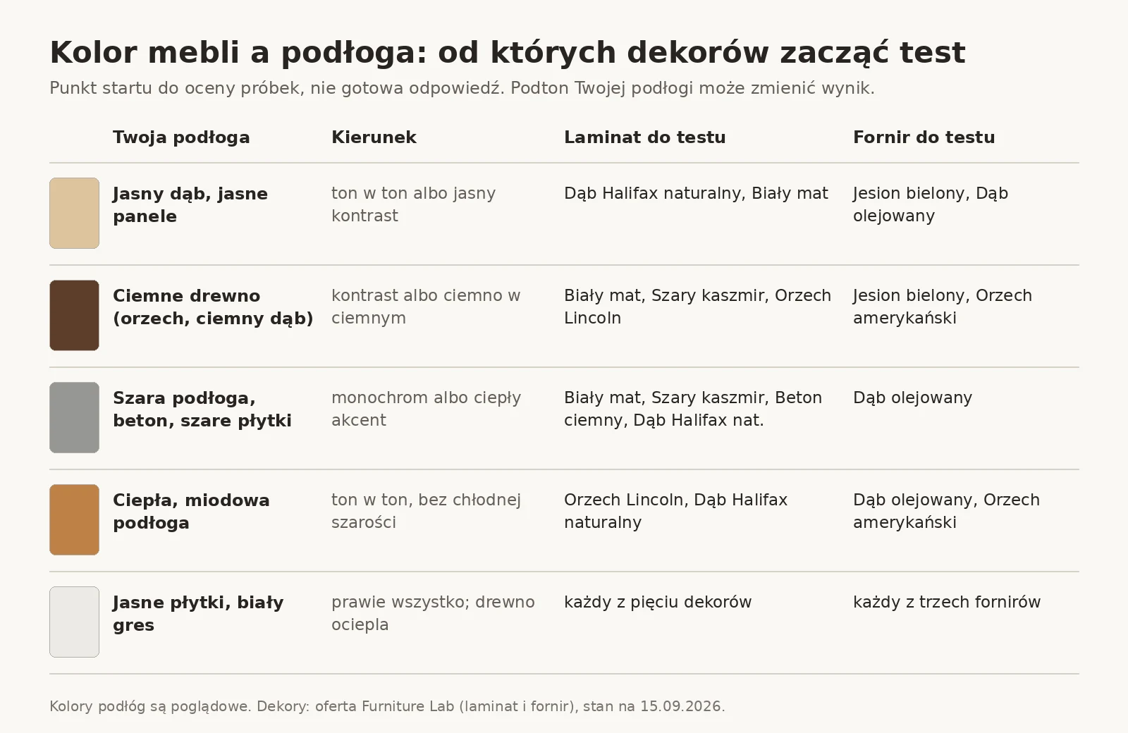
Table: decors to test for five types of floor
The table shows which of our decors to start the test with for a given floor. Treat it as a starting point for the 3 × 2 Test, because the undertone of your floor may change the result.
| Your floor | Direction | Laminate to test | Veneer to test |
|---|---|---|---|
| Light oak, light panels | tone on tone or light contrast | Dąb Halifax naturalny, Biały mat | Jesion bielony, Dąb olejowany |
| Dark wood (walnut, dark oak) | contrast or dark on dark | Biały mat, Szary kaszmir, Orzech Lincoln | Jesion bielony, Orzech amerykański |
| Grey floor, concrete, grey tiles | monochrome or a warm accent | Biały mat, Szary kaszmir, Beton ciemny, Dąb Halifax naturalny | Dąb olejowany |
| Warm, honey-coloured floor | tone on tone, no cool grey | Orzech Lincoln, Dąb Halifax naturalny | Dąb olejowany, Orzech amerykański |
| Light tiles, white porcelain stoneware | almost anything; wood warms the interior | each of the five decors | each of the three veneers |
Furniture colour and wall colour
Wall colour also affects how furniture looks, but a wall is easier to repaint than a front is to replace. So when choosing a decor, start with the elements you will not change: the floor, the worktop, the windowsill, the doors and the window frames. You can match the wall later. Treat interior doors like the floor: they are a fixed element, so pick the decor tone on tone with them or with a clear contrast.
Between the wall and the front, the same two routes apply as with the floor. A wall and a decor in the same undertone give a calm, tone-on-tone pairing. A clear difference in lightness, for example a dark decor on a light wall, shows off the volume of the furniture.
If you plan to paint, take a paint chart and judge it together with the decor sample in the 3 × 2 Test. A warm wall and a cool grey front can look good by day and stop matching under a 2700 K lamp. Warm light then strengthens the yellows in the wall and dulls the coolness of the grey. Handles change how a front looks in a similar way: black metal strengthens contrast and a light one softens it.
Light or dark furniture? Check where the light comes from
When choosing between light and dark furniture, consider where the light comes from. According to the US Department of Energy, north-facing windows admit fairly even light with little glare. East- and west-facing windows light the interior well in the morning and in the evening respectively, but can cause glare. The colour of daylight is described by the CIE references: light from a north sky (D75) is 7500 K, and light in the early morning and late afternoon (D50) is 5000 K (X-Rite).
Our tips for the test:
- A room with a north window: the light is even, but its reference (D75) is cooler than D65, which is midday daylight. If warm oak looks grey on the sample, compare it with a decor with a clearer warm undertone.
- East or west windows: plan one observation of the 3 × 2 Test for the time when the sun shines into the window. Then check whether glare on the worktop changes your rating.
- Bedroom and living room: if you mainly see the bedroom in the evening, let the evening observations decide a tie in the 3 × 2 Test. In a living room that you also use by day, count all the times.
- A dark decor in a poorly lit room: a dark board reflects less light than a light one, so check in the evening whether the front merges with the floor.
Colour harmony: the colour wheel, complementary and analogous colours
The colour wheel describes hue, not lightness. Tone on tone corresponds to colours lying close together on the wheel. The contrast of lightness mentioned above is a separate property that the wheel does not show. According to Canva, complementary colours lie on opposite sides of the wheel and give a pairing with high colour contrast. Analogous colours are three colours lying next to each other; such a pairing is versatile but can be overwhelming. The same page counts colours from red to yellow as warm, and blues, greens and violets as cool.
In the traditional RYB painting model, one pair of complementary colours is blue and orange (Wikipedia, Complementary colors). Wood with a warm undertone leans towards yellows and oranges. A beige or warm-brown wall lies close to it on the colour wheel and gives a pairing close to analogous. A cool, bluish wall lies opposite, so that is a colour contrast. With similar lightness, however, opposite undertones can look accidental (see above), so check such a pairing in the 3 × 2 Test.
White or wooden furniture? Our tip: white usually brings a weaker undertone than wood, so it is easier to pair both tone on tone and by contrast. Wood brings a clear warm undertone that you need to check against the floor and the wall.
How to combine the colours of several pieces of furniture in one room
When a room has several pieces, for example a chest of drawers, a bookcase and a TV unit, the tone-on-tone and contrast rules also work between them. Our tip: choose one main decor for the largest surfaces and a second only as an accent. Match the second decor to the first as you would to the floor: in the same undertone or with clearly different lightness. View the samples of all the decors together, side by side, in the morning and in the evening. Decors that look like the same shade in one light can differ in another (that is metamerism). A pairing that looks good by day can change character in the evening, because the colour of the light changes.
Furniture colour in a small room and a narrow hallway
In a small room a large piece of furniture dominates less when the front has a similar lightness to the wall behind it, because it stands out less from the background. A strong contrast, for example Orzech Lincoln on a white wall, emphasises the volume. It works when you want to highlight one piece, and with a floor-to-ceiling built-in unit it gives a very strong block of colour. We describe example layouts for small flats in the article on furniture for a 25 to 30 m² studio flat.
In a narrow hallway with no window, one time of day is enough: the test then has 2 observations (upright and flat) and 4 points at most. Judge a sample of a light decor, such as Biały mat or Jesion bielony, there under the hallway lamp, because there will be no daylight anyway. We set out the dimensions of wardrobes, passages and benches in the guide to wardrobes and benches for a 120 cm wide hallway.
The style of the interior will also narrow the choice. Scandinavian style is usually associated with white and light wood (for us, for example, Biały mat and Jesion bielony), and industrial with concrete and dark wood (for example Beton ciemny and Orzech Lincoln). Warm oaks and matt finishes are also one of the directions described in our overview of furniture trends for 2026.
Do you already have a floor and two decors to test? Check them on a specific form. The Komoda Fala (the Fala chest of drawers) is 160 × 45 × 78 cm in its default size, and you can change the width, depth and height to the centimetre. You will find other layouts and dimensions on the made-to-measure chest of drawers page.
Laminate and veneer: what no sample will show
A sample of laminated board shows a reproduction of a pattern, which is also what goes onto the furniture. Veneer is a thin sheet of real wood. Its sample shows the species and the finish, but not the exact pattern of your furniture.
Laminated board: the decor is a reproduction
In laminate we have five decors: Dąb Halifax naturalny, Biały mat, Szary kaszmir, Beton ciemny and Orzech Lincoln. With wood-effect and concrete decors, look not only at colour but also at the surface structure. The same pattern with a smooth and with a deep structure catches light differently. We explain the letters and digits in board names in the article on decor and structure codes of boards.
Veneer: every sheet is different
In veneer we offer Dąb olejowany, Jesion bielony and Orzech amerykański (oiled). The standard ANSI/HPVA HP-1-2024 for decorative plywood and panels reminds us that wood is a natural material and that many factors beyond human control affect its appearance. The same standard notes that the outer sapwood of a tree is often clearly lighter than the heartwood. Hence the differences in pattern and shade between sheets, even within one species.
Veneer also changes colour over time. The chapter on wood finishing in the Wood Handbook of the American Forest Products Laboratory describes two things. In the part on weathering it states that colouring compounds in wood change colour under UV or visible light. The change can go towards lighter or darker. In the part on interiors it adds that ordinary window glass stops most UV, so indoors it is mainly visible light that changes the colour. UV stabilisers in a finish do not have to prevent this.
Two practical rules follow. Do not compare a fresh sample with a wooden table that has stood in the sun for years, because the shades may differ. Treat veneered furniture as wood: a sample shows the species, the shade and the finish, and the pattern on the furniture will be different.
So that the colour does not change because of the wrong cleaning products, see what to clean laminate and veneer with.
When a sample looks different: a table and a checklist
When a sample looks different from what you expected, the cause is usually the light, the position of the board, the material or the photo. The table collects the situations from this guide in an "if you see X, do Y" form.
What you see on the sample and what to do about it
| What you see | Probable cause | What to do |
|---|---|---|
| It suits in the morning, looks too yellow in the evening | a warm 2700 to 3000 K lamp strengthens yellows | compare with a decor of a cooler undertone, or try a lamp with a higher colour temperature and CRI |
| The sample and the floor match by day and not in the evening | metamerism: colours matched in one light stop matching in another | judge in the light you use the room in most, and let that decide |
| The sample and the floor work together by day, less well in the evening | the colour of the light changes the proportions of warm and cool tones | repeat the judgement under the lamp you use in the evening; if the difference is large, check a decor closer in undertone to the floor |
| Fine upright, too light or with glare when flat | a worktop reflects the ceiling and the window | judge the sample flat again with the window covered; consider a matt or textured decor |
| It looks different in a photo than in person | the camera's white balance, screen calibration, night mode | judge in person; take photos only with a white sheet of paper in the frame |
| Two woods have similar lightness but a different undertone, and look accidental together | this is neither tone on tone nor a clear contrast | choose wood in the same undertone, or clearly lighter or darker |
| The veneer pattern in a photo of the furniture differs from the sample | every sheet of wood is different | judge the species, shade and finish, not the grain layout |
Checklist to print: judging a decor sample
Print this list and tick the points for each sample. One day of testing in the place where the furniture will stand is enough, and you make the decision the next day.
Before the test
- 2 or 3 decors chosen on screen with night mode off.
- The place for the furniture settled, and which boards will be upright and which flat.
- Colour of the light (K) and CRI read from the bulb packaging.
Morning and noon
- The sample stands upright in its final place (front).
- The sample lies flat (worktop, chest-of-drawers top, shelf).
- The sample compared with the floor, the wall and a white sheet of paper.
Evening
- The light you really use in the evening is on.
- The sample viewed upright and flat.
- The sample viewed up close and from the place where the furniture is most often seen.
- Structure and matt finish checked with a torch at a low angle.
Decision
- The sample held against the handles, the worktop and the fabrics.
- The 3 × 2 Test points entered on the sheet.
- The next day the choice still holds.
Download the checklist and the 3 × 2 Test sheet (PDF, 2 A4 pages)
Frequently asked questions about furniture colour and decor samples
How do I order a decor sample for made-to-measure furniture?
Ask the shop for a sample in exactly the decor, structure and finish in which the furniture will be made. Make sure it is a piece of board and not a print. At Furniture Lab, you ask about samples through the contact form.
Is the decor colour in a photo in an online shop accurate?
Not fully. A photo and a visualisation are a reproduction that the camera, the file and the screen change along the way. The board maker EGGER notes that colour-matched decors can be chosen only on the basis of an original sample.
What colour of light shows furniture colour best?
There is no single right colour. The reference point is midday daylight (reference D65, about 6500 K), but also judge the furniture in the light in which you spend your evenings, for example 2700 to 3000 K. A lamp with a high CRI helps.
Does veneered furniture change colour over time?
Yes. According to the Forest Products Laboratory handbook, wood changes colour indoors too, mainly under visible light, and the change can go towards lighter or darker. A new veneer sample can therefore differ from wood that has stood in the sun for years.
Can you combine two different wood decors in one room?
Yes, in two ways: tone on tone, when both woods have the same undertone, or through a clear contrast of lightness. The hardest case is two woods of almost the same lightness but a different undertone. View both samples side by side in the morning and in the evening.
Does matt white look the same in every light?
No. In warm 2700 K light, white usually moves towards cream, and in cool light from a north window it can look slightly grey. Compare the sample with a white sheet of paper and the ceiling at both times of day.
Summary: choose furniture colour in your own light
How to choose furniture colour? Start with the floor and other fixed elements, check their undertone and judge a physical sample, using the screen only to narrow the choice. Position the sample as the board will be in the furniture, view it in the morning, at noon and in the evening, and write the points on the 3 × 2 Test sheet. For the floor, choose tone on tone with a matching undertone or a clear contrast, and with veneer assume that every sheet will be different.
When your choice is ready, design a bookcase in the configurator or browse made-to-measure furniture. Production takes up to 10 working days, courier delivery is free across Poland and every piece of furniture has a 24-month warranty.
How we prepared this text. The facts about screens, light, metamerism and wood come from the primary sources listed below. These are a board maker's page, the W3C specification, Apple documentation and materials from makers of colour-measuring equipment (X-Rite, Datacolor). In addition there are an EU regulation, the ANSI/HPVA standard, a guide from the US Department of Energy and the Forest Products Laboratory handbook. The definitions for the colour wheel come from Canva materials and a Wikipedia entry (secondary sources). We checked the sources on 15 and 16 September 2026. Decor names, prices and dimensions come from our shop (as of 15 September 2026). The 3 × 2 Test and all the tables in the text are our own tips based on the principles described. They are not a measurement of our boards. The results in the 3 × 2 Test example are illustrative. We do not yet publish our own tests of samples under different light. The graphics in the text were prepared by the editorial team on the basis of the article. If you find an error, write to us through the contact form.
Sources
- EGGER, Virtual design studio: https://www.egger.com/pl/pomoc/planowanie-i-wizualizacja/wirtualne-studio-projektowe
- W3C, sRGB (Stokes et al., 1996): https://www.w3.org/Graphics/Color/sRGB.html
- Apple Support, True Tone and Night Shift: https://support.apple.com/en-us/109351
- X-Rite, Understanding Illuminants: https://www.xrite.com/service-support/understanding_illuminants
- Datacolor, What Is Metamerism?: https://www.datacolor.com/business-solutions/blog/what-is-metamerism/
- Canva, Color Wheel: https://www.canva.com/colors/color-wheel/
- Wikipedia, Complementary colors: https://en.wikipedia.org/wiki/Complementary_colors
- Commission Regulation (EU) 2019/2020: https://eur-lex.europa.eu/legal-content/PL/TXT/?uri=CELEX:32019R2020
- ANSI/HPVA HP-1-2024, clause 3.3.1: https://www.decorativehardwoods.org/sites/default/files/2024-10/ANSI-HPVA%20HP-1-2024.pdf
- U.S. Department of Energy, Daylighting: https://www.energy.gov/energysaver/daylighting
- USDA FPL, Wood Handbook, ch. 16: https://www.fpl.fs.usda.gov/documnts/fplgtr/fplgtr282/chapter_16_fpl_gtr282.pdf
Furniture for your wall, to the centimetre
See what you can design to measure, or go to the recommended page.
Read next
 Advice
How long does made-to-measure furniture take?
How long does made-to-measure furniture take? Up to 10 working days with us. See what that means in calendar days, in December too, and the production stages.
21 min read
 Furniture care
How to clean laminate and veneer furniture
How to clean laminate and veneer furniture? A YES/NO table for 12 household products, based on EGGER, Kronospan and oil makers. Check before you wash a front.
23 min read
 Do it yourself
How to hang a wall cabinet on any wall type
How to hang a wall cabinet on plasterboard, hollow block or concrete? Check the wall plug load capacity in fischer tables, work out the load and fit it.
34 min read